Green, Blue, Yellow, Red: Mapping Spatial Injustice

Maps can help us weave together different modes of analysis — different disciplinary lenses, different layers of data — by geolocating them to common (and ideally familiar) areas. Maps can be scribbled upon, annotated, pointed at, stacked, and even stood on. The fact that most of these features are digital as well as analog only expands their relevance across grade levels. On one map or a handful of them, the same location — the same thumbtack, footprint, star with “YOU ARE HERE” alongside — can hold data on populations, pollinators, political engagement, and an entire alphabet’s worth of other information.
These features make redlining maps generative anchor points for engaging spatial injustice from a range of disciplinary perspectives. In the 1930s, armed with drafting tools and a suite of four focal colors, the U.S. Home Owners’ Loan Corporation (HOLC) set out to map hundreds of cities and towns across the country. What was nominally a project of assessing home loan repayment risk by neighborhood — Green to Blue to Yellow to a “Hazardous” Red — was by design and in practice a massive national exercise in codifying discriminatory racial geographies from Akron to Atlanta to tiny Arkadelphia, Arkansas. “Redlined” areas, overwhelmingly composed of Black, immigrant, and other non-dominant communities, were refused mortgages that whiter, wealthier neighborhoods were granted.
In the classroom, these redlining maps help set historical contexts of racial and economic marginalization for other sets of data that might be layered together with them. They also help contextualize the social and material impacts that maps have had across time — the historical roles they’ve played in the tool kits of the powerful, and how it’s up to all of us, in our classrooms, to repurpose them toward more just social and scientific ends. Here I outline several paths of inquiry to highlight how traditionally “scientific” frames (air quality, particulate matter pollution) can be grounded in and explored through the racialized histories of injustice that redlining maps help illustrate.
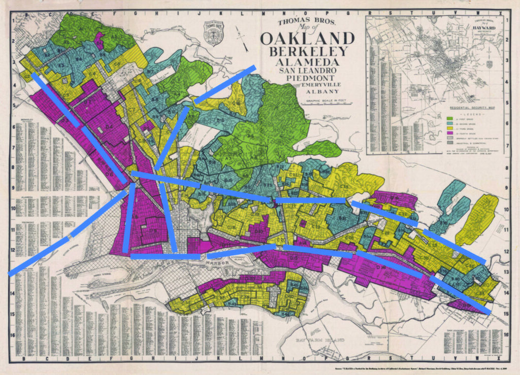
One possible entry point for exploring spatial injustice with redlining maps is to look at the construction and impacts of interstate highways. In workshops with teachers and with undergraduate students, my colleagues and I have used a map of the East Bay Area in Northern California. By placing thin strips of paper on top of the map, we’ve annotated the paths of highways that we’ve driven on or seen. For this particular map, the product might look something like the map above. If you live in a city or town with a redlining map, you can try this exercise yourself. Straightforward as it is, it can surface some powerful questions, noticings, and wonderings.
Teachers might prompt students to think about the different paths taken by these different highways. Students might notice right away that the largest of them (Interstate 80, along the bottom of the map) runs almost entirely through redlined areas. Following its path, teachers could ask students why and how they think West Oakland, a historical center of Black communities in Oakland (redlined area at middle left), came to be completely encircled by these highways. Adding another dimension, teachers might offer background on local policies regulating freight truck traffic, which can only travel on Interstate 80 and not Interstate 580, which runs north of downtown Oakland through a more heterogeneously “graded” set of neighborhoods. Teachers could then ask students to reflect on why that is and what possible relationships might there be between redlining and the nature of these two highways. As another example of these relationships, teachers could ask students why they think these highway paths completely skirt Piedmont, one of the most affluent neighborhoods in the Bay Area represented in blue and green in the middle of the map. Each of these observations and questions could spur different paths of historically grounded inquiry.
Adding another layer of data may also help students explore the impacts of these highway patterns alongside the social and historical foundations on which they were built. In particular, students can explore data related to unhealthy air: transportation-related emissions that impact air quality, or the health impacts of these emissions.

As one of many possible examples here, the map above shows data on diesel particulate matter (P.M.) emissions for each census tract in the redlining map above, ranked by statewide percentile. These emissions are closely related to freight transit on highways, as well as certain industrial activities. On the map, any census tract below the 50th percentile for emissions is shown in light gray. Census tracts in shades of blue are in the 50th percentile and above, with darker colors indicating more diesel P.M.
The impacts of pollutants emitted along these transportation corridors are significant. In West Oakland, due to a variety of factors (including access to consistent medical care), life expectancy is up to seven years lower than in most of surrounding Alameda County. With older students, one might use a set of online mapping tools like ArcGIS (free to students and educators, and the platform from which this map was made) to digitally layer this data, health outcomes, redlined areas, and highway routes on top of each other. With paper strips, transparency sheets, paper printouts and markers, students can layer this data computer-free. Transposing the paper highways onto this map, we can closely follow the path of I-80 through a swath of some of California’s most polluted census tracts. In an anatomy and physiology course, for example, students could investigate the health impacts of concentrated diesel P.M., hypothesize about their distribution across the city, and then create maps to test their hypotheses and communicate their findings to a constituent audience they identified in the community. In a chemistry or environmental science course, students could follow much the same process with a focus on other pollutants co-emitted with diesel P.M. and their other health or environmental impacts.
Redlining maps are excellent tools for analyzing injustice since they are illustrative and localized in ways that few other documents are. For students and for us all, the achievement of a just and sustainable future depends on our ability to interrogate the social production of space, to imagine and enact more equitable places.

